Reducing eCommerce Checkout Friction: 2026 Guide

Cart abandonment tells you shoppers are leaving. It doesn’t tell you where the experience broke down. Reducing eCommerce checkout friction starts with treating checkout as a sequence of effort across the storefront, payment flow, and trust signals, not as a single screen to polish.
It’s tempting to fix the most visible issue first: shorten a form, move a button, or add another payment option. But an isolated tweak can miss the moment that’s costing you completed orders. Unexpected costs, unclear steps, mobile usability problems, and payment failures can each shake shopper confidence.
This guide shows you how to trace friction through shopper behavior and funnel data, identify where customers get stuck, and prioritize fixes by evidence, effort, and potential impact. You’ll also learn how to measure whether checkout is becoming clearer and easier to complete. The aim is a practical optimization process: map the journey, investigate the evidence, make focused changes, and track what improves.
Key Takeaways
- Map the journey from cart review to order confirmation to spot where extra effort, uncertainty, or failure may interrupt a purchase.
- Use funnel completion, field errors, payment outcomes, behavior signals, and customer effort feedback to investigate checkout obstacles.
- Prioritize fixes by how often and severely they affect shoppers, how strong the evidence is, and how much effort implementation requires.
- Make reducing eCommerce checkout friction a coordinated storefront priority, aligning checkout design, development, payment behavior, and customer insight.
- Test focused changes and monitor the same signals over time to see whether checkout is becoming easier to complete.
Reducing eCommerce Checkout Friction Starts With Understanding Shopper Effort
A shopper has chosen a product and moved closer to buying. Now they need to confirm delivery details, enter information, select a payment method, and place the order. This is a high-intent moment, but every extra decision or confusing step adds effort. Reducing eCommerce checkout friction starts with understanding that effort, not guessing at interface changes.
Checkout friction is avoidable effort, uncertainty, delay, or failure between checkout start and order confirmation.
Abandonment is the outcome, not the diagnosis. A shopper might leave because delivery costs appear late, a payment is rejected, or checkout takes too long to load. Another might simply decide not to buy. Cart abandonment can also happen before checkout begins, such as when someone adds an item but never starts the purchase process. Separate these behaviors before drawing conclusions: checkout-start data helps isolate problems in the purchase flow, while cart data includes earlier decisions.
What counts as checkout friction in an online store?
Friction can surface in five connected areas. Each creates a different kind of effort, so the right fix depends on what the shopper encounters:
- Usability: Confusing fields, unclear labels, or a hard-to-find way to correct an entry.
- Information: Delivery costs, timing, or other order details that are difficult to find or understand.
- Payment: A rejected transaction, limited suitable payment choices, or unclear payment instructions.
- Performance: Slow page loads, stalled buttons, or errors that interrupt progress.
- Trust: Uncertainty about the total, order details, or what happens after selecting “Place order.”
An obstacle may look minor to the team and still matter to a shopper ready to buy. A form that rejects a valid address or a delivery charge revealed at the final step can force extra work at exactly the moment the customer expects a clear path to confirmation.
Why checkout effort matters beyond conversion rate
Unnecessary effort can trigger hesitation, lead shoppers to abandon checkout, or prompt them to contact support for answers the page should provide. Even when a shopper completes the order, a confusing experience can weaken confidence in the purchase and the store. Checkout clarity is therefore a customer-experience priority, not just a conversion-rate lever.
It’s also a revenue-efficiency issue. Teams invest in attracting shoppers and presenting products; avoidable checkout obstacles can prevent some of that demand from becoming completed orders. But don’t treat every abandoned checkout as a recoverable sale. Some shoppers change their minds or encounter circumstances no design change can resolve. The goal is to identify preventable effort, understand its effect, and focus improvements where evidence points to a real obstacle.
Where eCommerce Checkout Friction Builds Across the Purchase Journey
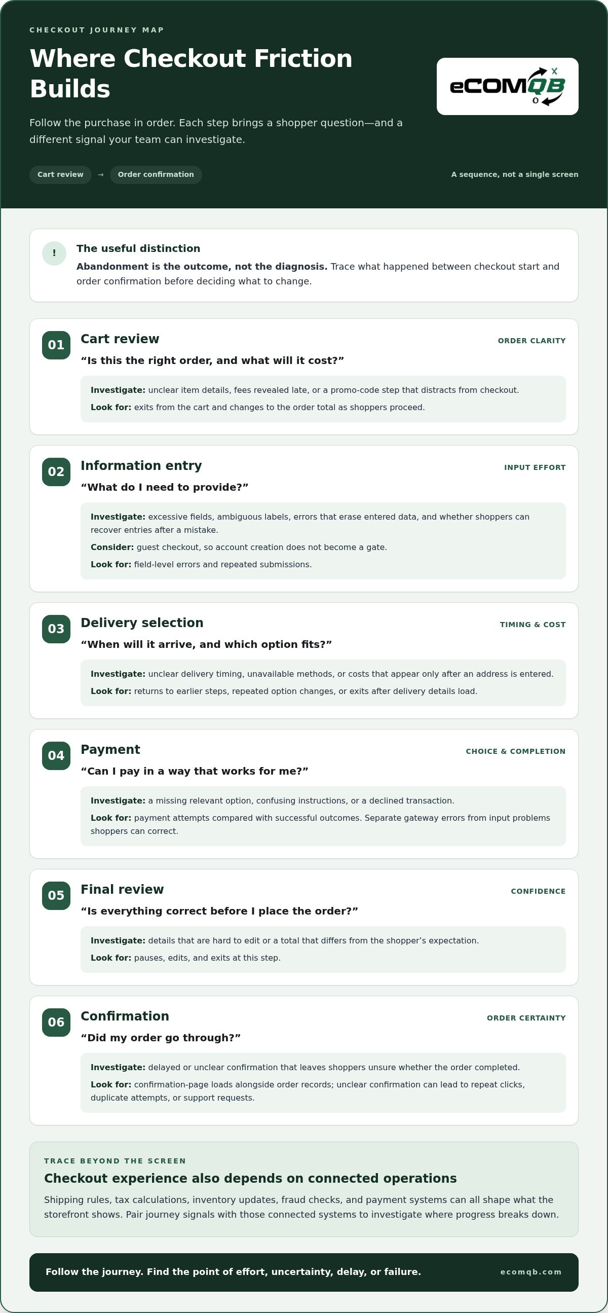
Checkout is a sequence, not a single screen. A shopper can move smoothly through one step, then stall because a cost changes, a form won’t accept an entry, or a payment doesn’t go through. To find the break, follow the journey in order and pair each likely shopper question with a signal your team can investigate.
Checkout friction can start in the interface or in the connected operations that determine what the interface shows. Shipping rules, tax calculations, inventory updates, fraud checks, and payment systems can all shape the front-end experience. Reducing eCommerce checkout friction means tracing the full path, not just inspecting button placement.
- Cart review: “Is this the right order, and what will it cost?” Look for unclear item details, fees revealed late, or a promo-code step that distracts from checkout. Investigate exits from the cart and changes to the order total as shoppers proceed.
- Information entry: “What do I need to provide?” Excessive fields, ambiguous labels, and errors that erase entered data raise input effort. Review field-level errors, repeated submissions, and whether shoppers can recover their entries after a mistake. Offer guest checkout so account creation doesn’t become a gate.
- Delivery selection: “When will it arrive, and which option fits?” Unclear timing, unavailable methods, or a cost that appears only after an address is entered can force a late reconsideration. Check whether shoppers return to earlier steps, change options repeatedly, or leave after delivery details load.
- Payment: “Can I pay in a way that works for me?” A missing relevant option, confusing instructions, or a declined transaction can interrupt progress. Compare payment attempts with successful outcomes, and separate gateway errors from shopper-correctable input problems.
- Final review: “Is everything correct before I place the order?” Hard-to-edit details or a total that differs from the shopper’s expectation can create last-second doubt. Investigate pauses, edits, and exits at this step.
- Confirmation: “Did my order go through?” A delayed or unclear confirmation can lead to repeat clicks, duplicate attempts, or support requests. Check confirmation-page loads and order records together.
Which checkout problems create the most avoidable effort?
Surprise fees and vague delivery timing shift important decisions to the end, when shoppers expected to confirm, not recalculate. Long forms and weak error messages make progress feel fragile. Forced account creation adds a separate task before purchase. Payment declines need their own diagnosis: a legitimate transaction may be rejected by payment or fraud systems, while an interface failure may prevent the transaction from being submitted at all.
Why mobile and payment experiences need separate attention
On a small screen, crowded layouts, slow loading, and controls that are difficult to tap can turn routine entry into repeated effort. Review mobile behavior separately, including field errors and exits at each step. Relevant payment choices can also remove unnecessary steps for different shoppers. A false decline isn’t automatically a shopper mistake; compare transaction outcomes with payment-system responses before changing the interface.
When friction spans storefront design and connected systems, a coordinated review can help clarify where the journey is breaking down. Discuss your checkout and storefront strategy.
How to Measure Checkout Friction With Funnel Data and Customer Effort
Checkout data is most useful when it connects what shoppers do with what they experience and whether they complete an order. A single conversion rate shows the result, but not the step or obstacle behind it. Build a measurement view that combines funnel progression, errors, payment outcomes, behavior signals, and customer feedback.
Behavior shows what shoppers do, customer effort score shows how easy they say the interaction felt, and transaction data confirms whether an order was completed. These signals answer different questions. Used together, they help narrow the diagnosis; none should be treated as a root cause on its own.
Which checkout metrics help locate the drop-off?
Track how many shoppers who reach each checkout step proceed to the next, then compare cohorts using the same definitions and time window. Make the denominator explicit for every rate: for example, calculate payment completion from shoppers who attempted payment, not all site visitors. Separate mobile and desktop, then segment carefully by traffic source, market, and new or returning customer status.
| Measure | What to track | Signal to investigate |
|---|---|---|
| Funnel completion | Shoppers advancing from each step, with the eligible step entrants as the denominator. | A sharp drop between two stages points to a place to inspect, not proof of a specific cause. |
| Field errors | Validation errors and resubmissions per field interaction or form attempt. | Repeated errors around one field may indicate unclear instructions, formatting rules, or recovery problems. |
| Payment outcomes | Successful, declined, and errored attempts as a share of submitted payment attempts. | Separate issuer declines, gateway errors, and interface issues where the available data allows. |
| Behavior signals | Exits, repeated clicks, backtracking, and loading delays by checkout stage. | Look for patterns that coincide with a step, device, or technical delay. |
| Customer effort score | Survey responses about the ease of a specific interaction. | Compare reported difficulty with the behavior and transaction pattern around that interaction. |
How customer effort score adds context
Customer effort score (CES) is a survey measure of how easy or difficult a customer felt an interaction was. Ask a short question close to the relevant checkout interaction, such as after an order attempt, and name the step being evaluated. Keep the wording, response scale, and survey timing consistent so comparisons remain meaningful.
CES adds the shopper’s perspective, but it can’t tell you by itself whether the cause was a confusing field, slow page, or payment issue. Pair responses with funnel and error data, and compare results across the same device, market, and time period. If shoppers report difficulty while errors cluster at address entry, investigate that step before redesigning the entire checkout. For reducing eCommerce checkout friction, use the evidence to form a testable diagnosis, then track the same measures after a change.
How to Prioritize Checkout Fixes Without Guessing
A long list of checkout issues doesn’t tell your team what to tackle first. Build a ranked backlog from evidence, customer impact, and implementation effort. That gives design, development, and payment teams a shared plan instead of a queue driven by the loudest opinion.
Use this five-step workflow to move from a signal to a decision:
- Locate. Identify the checkout step and shopper segment associated with the issue. Pinpoint where progression changes, errors cluster, or shoppers repeatedly try the same action.
- Validate. Compare funnel data with error patterns, session observations, and customer comments. Check whether the issue recurs and whether the evidence points to the same suspected cause.
- Rank. Assess frequency, severity, affected shoppers, confidence in the diagnosis, and implementation effort. A repeated blocker with strong evidence deserves more attention than a cosmetic preference or one isolated comment.
- Test. Choose a focused change and, where practical, use a controlled test. Quick clarity fixes, such as explaining a field label, may be easier to isolate than payment, integration, or performance work that requires deeper coordination.
- Monitor. Recheck the outcome and guardrails after launch. Document what changed, when it changed, and what else was happening, so a shift in traffic or campaigns isn’t mistaken for the effect of one edit.
Turn checkout signals into a ranked backlog
For each candidate fix, record the affected step, shopper segment, suspected cause, supporting evidence, and estimated effort. Combine quantitative signals with customer observations before committing. Then use this simple matrix to decide what moves first:
- Strong evidence, high impact: Prioritize and test promptly.
- Strong evidence, lower impact: Schedule based on effort and available capacity.
- Limited evidence, high impact: Validate the diagnosis before a major build.
- Limited evidence, lower impact: Defer, or gather more evidence before adding it to active work.
Within each group, favor repeated, severe obstacles affecting more shoppers, while accounting for how confidently the cause is understood and how much work a fix requires. This keeps one striking anecdote from outranking a persistent pattern.
Test changes and verify whether effort falls
Before launch, define one primary outcome, such as progression through the affected step, plus guardrails such as error rates, payment outcomes, and customer effort feedback. Compare like-for-like cohorts over consistent time windows. Note changes in traffic mix or campaigns, and avoid crediting every lift to a single edit when several variables moved.
For complex checkout issues, discuss a checkout improvement plan grounded in your storefront and the evidence you’ve collected. This keeps reducing eCommerce checkout friction focused on measurable obstacles, not assumptions.
Build a Lower-Friction eCommerce Checkout Into the Storefront
Checkout doesn’t operate in isolation. It inherits expectations set by product pages, the cart, delivery information, and the payment experience. If an item’s availability or price changes unexpectedly, or delivery details appear inconsistent, shoppers have to stop and reconcile the difference. A well-connected storefront keeps information coherent as customers move from discovery to order confirmation.
Connect checkout improvements to the whole storefront
Review the handoffs. Product details should match the cart, delivery choices should reflect the order, and the final total should be understandable before payment. That consistency depends on design and development working together with the systems that supply inventory, shipping, tax, and payment information. A checkout redesign alone won’t resolve a mismatch originating elsewhere.
Personalization can make the storefront more relevant when it helps shoppers find useful products or information before checkout. It shouldn’t add new decisions or distractions once someone is ready to pay. For example, AI for Shopify personalization is most useful to this journey when tailored experiences support relevance without disrupting a clear path to purchase.
Reducing eCommerce checkout friction means improving the whole experience, not adding technology by default. First identify the obstacle. Then decide whether the right response is a content adjustment, interface change, technical fix, or coordinated storefront update.
Choose an implementation path grounded in evidence
Match the scope of the solution to the scope of the problem. If shoppers misunderstand one label, a focused design change and a clear measurement plan may be enough. If the issue involves inconsistent totals, slow-loading steps, or payment handoffs, the work may need coordinated storefront development across design, Shopify implementation, and connected systems.
Personalization also needs a specific job. Use it where customer insight shows that a more relevant storefront experience could help, not as a default addition to checkout. Keep the payment path predictable, and measure the change against the friction signal that prompted it.
eComQB brings eCommerce strategy, Shopify design and development, and AI personalization into storefront work. This combination supports teams whose evidence points beyond a quick interface adjustment to a connected experience issue. The implementation should follow the diagnosis, fit the store’s needs, and be measured against a defined outcome. No platform feature or redesign can replace that discipline.
For a tailored implementation approach, discuss checkout friction and storefront improvements.
Make Your Next Checkout Improvement Count
The next step isn’t a sweeping redesign. It’s choosing one well-supported opportunity and building a focused plan to address it. Keep the shopper’s experience at the center, align the right people around the work, and make measurement part of implementation from day one. That’s how reducing eCommerce checkout friction becomes an ongoing discipline rather than a one-off cleanup.
If the evidence points beyond a small interface adjustment, eComQB can connect the work across Shopify website design and development, AI personalization experiences, and managed eCommerce growth systems. The right approach depends on what your storefront data and customer feedback reveal, not on adding technology for its own sake.
Book a conversation about reducing checkout friction to map a tailored next step for your store. You’ve got the signals; now turn them into a clearer path forward. Keep testing, keep learning, and make every improvement earn its place.
Frequently Asked Questions
Is checkout friction the same as cart abandonment?
No. Checkout friction refers to obstacles within the checkout experience, while cart abandonment describes leaving without buying. A shopper can abandon a cart before starting checkout, perhaps while comparing products, or leave after an obstacle such as an address error. Separate cart creation from checkout initiation in your analytics. Then investigate the stage where shoppers stop, rather than treating every incomplete cart as evidence of a checkout problem.
Can customer effort score measure checkout friction on its own?
No. Customer effort score captures how easy or difficult respondents say an interaction felt, but it can’t explain the cause or represent shoppers who didn’t answer. For reducing eCommerce checkout friction, ask a consistent question after a defined interaction, then compare responses with step progression and operational records. For example, a low ease rating after payment should prompt a review of transaction results and page behavior, not an automatic redesign.
How do I know whether checkout friction is affecting mobile shoppers more?
Compare mobile and desktop shoppers who reach the same checkout step, using matching time periods and similar traffic sources where possible. Look for differences in completion, validation problems, payment outcomes, and page responsiveness. Then inspect mobile interactions around the point of difficulty, such as whether a keyboard covers a required field. A gap identifies where to investigate; it doesn’t prove the device itself caused the issue.
Does a one-page checkout always reduce friction?
No. A single page can reduce navigation between steps, but it can also make the process feel dense, especially on a phone. Consider whether shoppers can scan sections, understand what’s required, and correct details without losing progress. Test the structure with a defined audience and compare completion alongside errors and reported ease. Page count is a design choice, not a reliable measure of how simple checkout feels.
Can accessibility improvements make checkout easier for all shoppers?
Often, yes. Clear labels, readable contrast, keyboard-operable controls, and useful error instructions can support shoppers with different access needs and make the flow easier to understand more broadly. Check more than visual appearance: try completing checkout with a keyboard, zoomed text, and assistive technology. Review against accessibility standards that apply to your business and markets, and include people with varied access needs in usability testing.
How often should an eCommerce team review checkout friction?
Set a regular review rhythm that matches your store’s traffic and release pace, then add checks after changes that could affect checkout, such as a payment configuration update or redesign. Keep a baseline so teams can distinguish normal variation from a meaningful shift. If a metric moves unexpectedly, investigate the affected step and recent changes before making another adjustment. Avoid bundling unrelated updates, which makes their effects harder to interpret.
Should an online store offer every available payment method?
No. A larger payment menu can make checkout harder to scan and maintain, while some methods may not suit your shoppers or markets. Review payment completion and failure patterns by customer location and device, then prioritize options that match demonstrated needs. Make each method’s terms and next steps clear. Reassess the mix when customer behavior changes, and check that adding an option doesn’t create new errors or confusion.